Business Website Banner Design with White and Green
Discover a better way to do business - let us help you achieve your goals!
Business Website Banner Design with White and Green
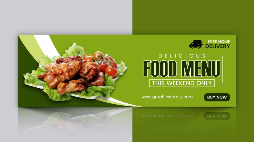
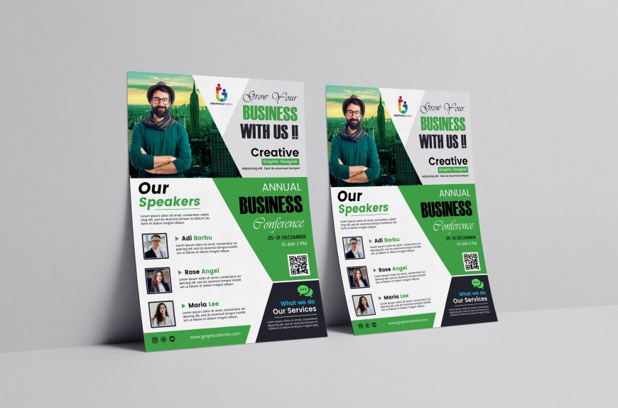
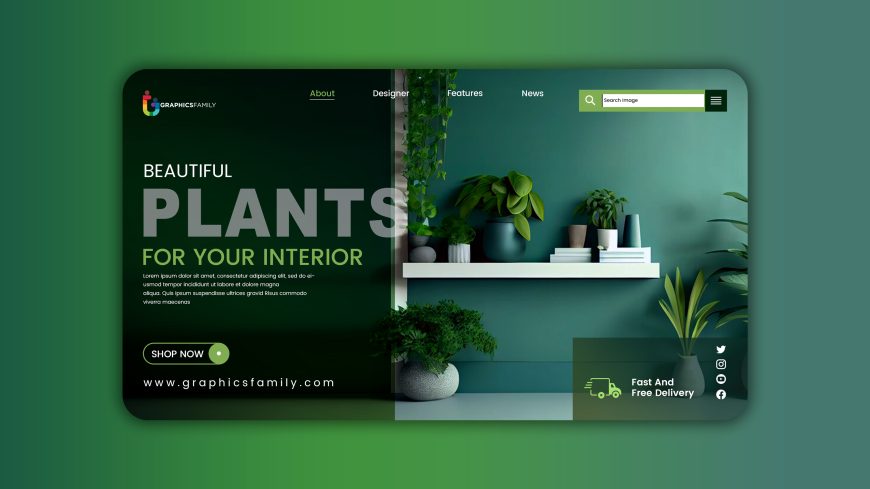
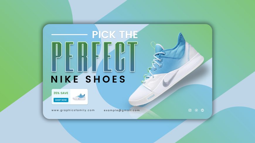
A Business Website Banner Design with White and Green is a visual representation of a company’s brand and message that is intended to attract potential customers and communicate the value proposition of the company. These banners are typically displayed on a company’s website’s homepage and should be designed to capture the viewer’s attention and encourage them to explore the website further.
The colors white and green should be used deliberately and strategically in the banner design, with the colors chosen to represent the company’s brand and message. Green is often associated with growth, harmony, and balance, whereas white is often associated with purity, clarity, and simplicity. These colors together can convey a sense of calm, cleanliness, and professionalism.
The banner should be simple and clean in design, with a clear message and call-to-action that encourages viewers to take action, such as investigating the company’s products or services, signing up for a newsletter, or contacting the company for more information. To reinforce brand recognition and messaging, the banner should also include the company’s logo and tagline.
Overall, a White and Green Business Website Banner Design should effectively communicate the company’s brand and value proposition while also creating a professional and welcoming impression. Companies can attract new customers and encourage them to explore their website further by creating an engaging and visually appealing banner.
Business Website Banner Design with White and Green Features:
Editable with Photopea, Adobe Photoshop CS6 or any newer version.
– .PSD 100% Editable.
– 100% Customizable.
– High Quality
– Fully Layered Design Template.
– .PSD (Source File)
Download
2032 downloads


